
Is Your Website Costing You Customers? 5 Signs It’s Time for a Redesign

Your website is your hardest-working salesperson. It runs 24/7, never sleeps, and often serves as the first impression someone has of your business.
But here’s the uncomfortable truth: if your website feels outdated, clunky, or confusing, it’s actively driving potential customers away.
So how do you know if it’s time to invest in a redesign? Here are five red flags that might mean your website is costing you sales every single day.
1. Slow Load Times → Lost Sales
Nobody likes waiting, and online shoppers are less patient than ever. In fact, 53% of visitors leave a site that takes longer than 3 seconds to load (Google Business). That means if your site is dragging its feet, you’re losing more than half your potential leads before they even see your offer.
I once worked with a client whose homepage took nearly 8 seconds to load because of oversized images and tons of unused JavaScript. After optimizing and redesigning, we cut it down to under 2 seconds—and their bounce rate dropped by 40%. That’s the effect that speed can have on your sales.
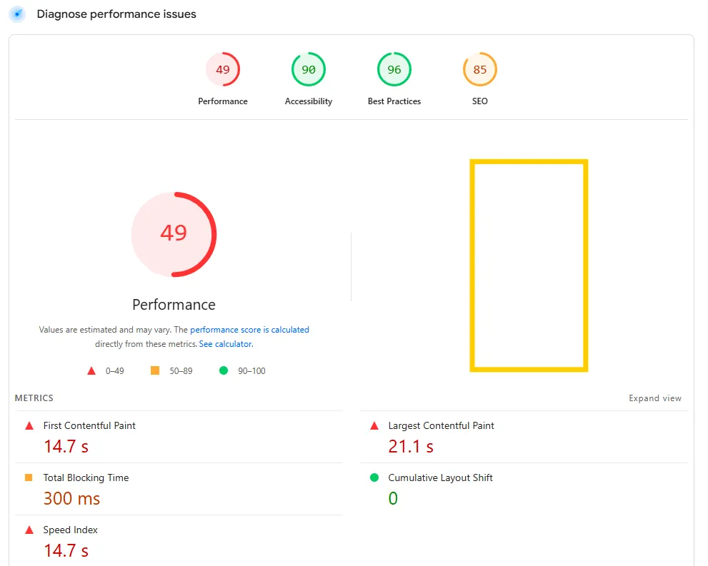
Find out how your site holds up:
Run a free test with Google PageSpeed Insights. If your site is in the red, it’s definitely time to upgrade.
2. Outdated Branding → Loss of Trust
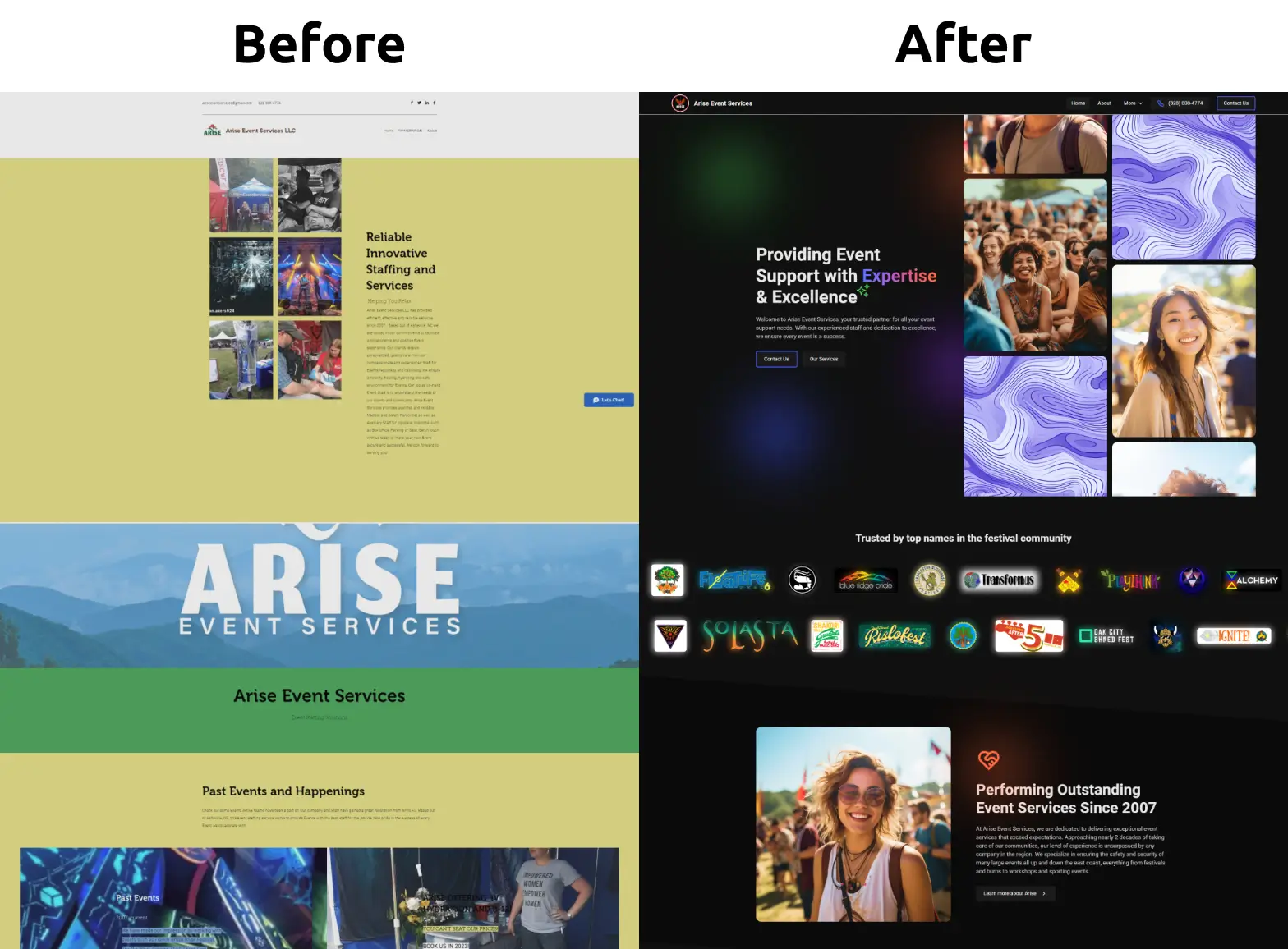
Imagine walking into a musty store with peeling paint, flickering lights, and dusty shelves. Would you feel confident buying there? Maybe you would...? 😂 But most people probably wouldn't feel comfortable in that kind of environment. The same logic applies online.
If your website design looks stuck in 2010—or doesn’t match your current branding—it can quietly erode trust. Buyers today expect sleek, modern experiences that reflect your professionalism.
Pro Tip: Design trends shift roughly every 2–3 years. If your site hasn’t had a facelift in 5+, chances are it’s giving the wrong impression.
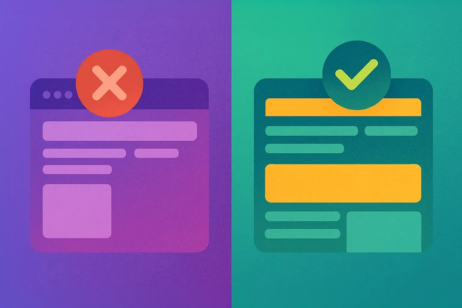
Below is an example of good vs bad design from one of my client's websites.
3. Poor Mobile Usability → Frustrated Buyers
Over 60% of web traffic now comes from mobile devices. If your site is hard to use on a phone—tiny buttons, cut-off text, requires lots of pinching and zooming (I'm sure you've used some of those sites) customers will give up and move on.
I can’t tell you how many times I’ve seen businesses pour thousands into ads, only to discover that mobile visitors couldn’t even click “Buy Now” without scrolling to the right and zooming in.
👉 Test this yourself: Open your website on your phone and try to complete a simple action—like filling out a form or checking out. If it feels clunky, so will it for your customers.
4. No Clear CTAs → Missed Sales
Every page on your website should answer the question: “What do I do next?”, and strong CTAs (calls-to-action) are the key here.
One way I've found it helpful is to think about CTAs through the lens of environmental cues. The same way exit signs in a building tell you exactly where to go without thinking, a good CTA guides your users to learn more about your product, fill out a lead gen form, or purchase something.
Without clear calls-to-action, visitors drift from page to page aimlessly and leave without converting. Some common mistakes include not having strong CTAs at all, using non-descriptive buttons, or hiding CTAs at the very bottom of the page.

A client of mine swapped a generic “Submit” button for “Book Your Free Strategy Call” and saw inquiries double within a month.
Key takeaway: Strong CTAs motivate people to act, and remind them what they're supposed to do.
5. Hard to Maintain and Update → Wasted Time & Money
Small updates shouldn't cost an arm and a leg:
Your business has to move fast to keep up with the ever-demanding market we find ourselves in today. If every small update, (like changing text, adding an image, updating pricing, etc.), requires calling a developer, your website is overly complicated.
Modern websites are built on platforms like Webflow that let you or your team easily update content yourself. If your site feels like a mysterious thing only your developer can use, then it’s likely draining your money, and costing you growth opportunities.
Maintaining VS. Growing:
You shouldn't be spending all your website budget on maintaining it. It genuinely surprises me how many business owners are still blowing their budget on fixing plugins (that worked last week but not this week), and how many still pay for site backups, security certificates, and all the other upsells. *Cough* WordPress Agencies *Cough*
When a client calls me, it's almost always for growth. "We'd like a new landing page to help us capture leads.", "We want to expand our blogs into full length guides to build trust with our customers.", and "We'd like an ROI calculator built-in to our contact page to provide users with upfront cost estimates." are just a few examples of what conversations with your developer should be like.
📈See more examples of growth driven resources we can build together for your website.
Wrap-up
If you found yourself nodding along to any of these signs, your website might be costing you customers right now.
But here’s the good news: you're armed with the knowledge you need to get a competitive edge.
A redesign can help you:
- Convert more visitors into leads (literally make more money)
- Reflect your brand’s true professionalism (which builds trust with new and existing clients)
- Save time with easy updates
- Future-proof your online presence
👋 If you’re wondering how your site stacks up, let’s chat and see what's possible. A modern redesign could be the difference between visitors bouncing—or buying.
More recent insights


