

Choosing the Right Color Scheme for Your Website

How Color Psychology Affects User Behavior and Tips for Selecting Colors
Picking the right color scheme for your website isn't just about making it look pretty. Colors can influence how visitors feel and act when they land on your site. So, let’s explore how color psychology works and get some tips on choosing the perfect palette for your project.
The Role of Color in Web Design

First Impressions
Did you know it takes only about 50 milliseconds (that’s 0.05 seconds!) for users to form an opinion about your website? (source) And a big part of that impression comes from color. A well-chosen color scheme can make your site look professional and inviting, while poor color choices can turn visitors away in a heartbeat.
Brand Identity
Colors also play a huge role in branding. Think about iconic brands like Coca-Cola or Facebook. The red of Coca-Cola evokes feelings of excitement and energy, while Facebook's blue exudes trust and reliability. These colors aren't just random picks; they are carefully chosen to reinforce each brand's identity and make them instantly recognizable. Your website’s color scheme should do the same—reflect your brand’s personality and values, creating an emotional connection with your audience and ensuring your brand stands out in their minds.
Understanding Basic Color Psychology
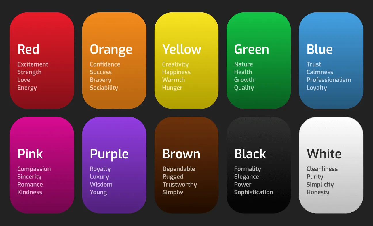
Colors can evoke different emotions and behaviors. Here’s a quick rundown of common associations:
- Red: Energy, urgency, passion. It’s great for calls-to-action.
- Orange: Confidence, success, bravery, sociability. It’s an energetic and vibrant color that can evoke excitement and enthusiasm.
- Yellow: Optimism, happiness, attention. Good for grabbing attention but use sparingly.
- Green: Growth, health, tranquility. Perfect for eco-friendly and wellness brands.
- Blue: Trust, calmness, professionalism. Ideal for corporate and healthcare sites.
- Pink: Compassion, sincerity, romance, kindness. Often associated with love and care, it can create a soft and nurturing feeling.
- Purple: Luxury, creativity, wisdom. Works well for high-end and creative brands.
- Brown: Dependable, rugged, trustworthy, simple. It gives a sense of stability and reliability.
- Black: Elegance, power, sophistication. Best for luxury and modern designs.
- White: Simplicity, cleanliness, purity. Keeps your design clean and minimal.
Knowing how color can influence your users is a great starting place, but you might be wondering how to effectively apply these principles to your website. In the next section, we’ll dive into practical tips and strategies for choosing and combining colors to create a cohesive and visually appealing design that truly represents your brand.
Tips for Choosing a Color Scheme
1. Know Your Audience
First things first: consider your audience. Different colors can have different meanings in different cultures. What works in one region might not in another. For instance, if you're designing a website for a local coffee shop in Asheville, you might choose earthy tones like browns and greens to reflect the town's love for nature and sustainability.
However, if your audience is more diverse or international, you’ll need to be mindful of how colors are perceived globally. In some cultures, white symbolizes purity, while in others, it can signify mourning. Do some research on your target audience’s preferences and cultural context to make informed decisions that resonate with them.

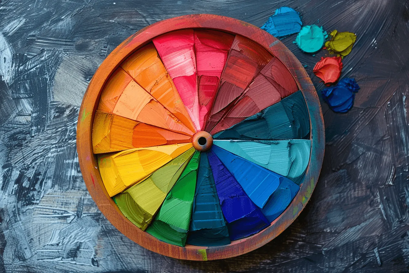
2. Use a Color Wheel
The color wheel is a designer’s best friend. It helps you understand how colors relate to each other. Here are a few color schemes to consider:
- Complementary: Colors opposite each other on the wheel (e.g., blue and orange). They create high contrast and vibrant looks.
- Analogous: Colors next to each other on the wheel (e.g., blue, blue-green, and green). They’re harmonious and pleasing to the eye.
- Triadic: Three colors evenly spaced around the wheel (e.g., red, yellow, and blue). They offer a balanced yet colorful palette.
I’ve linked to some of my favorite color-picking tools further in this article if you’re interested.
3. Start with a Base Color
Choose a primary color that represents your brand. This will be the dominant color in your palette. From there, select secondary and accent colors that complement your base color. A helpful tip is to start by designing in black and white. Building the first draft without color can help you focus on the overall layout and ensure your color choices later are consistent and balanced, avoiding overpowering or underwhelming designs.
4. Consider Contrast and Readability
Contrast is key to readability. Make sure there’s enough contrast between your text and background colors. Tools like the WebAIM Contrast Checker can help you ensure your site is accessible to everyone, including those with visual impairments.

5. Limit the Number of Colors
Less really is more when it comes to color schemes. Stick to three to five colors (this includes your background and text colors!) to keep your design cohesive and focused. Too many colors can overwhelm your visitors and dilute your message. Sometimes I’ll visit Minimal Gallery to help inspire me with simple color schemes, and then build from there if needed.
6. Test Your Color Scheme
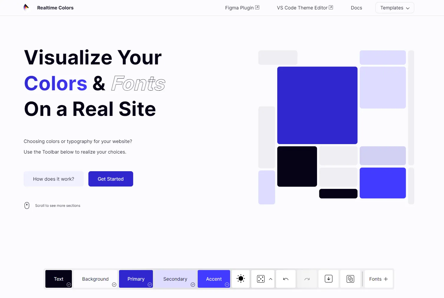
Before you go live, test your color scheme in real-world scenarios. Check how it looks on different devices and screens. Gather feedback from users and be ready to make adjustments if needed. An incredible tool you can use to test your site colors live is Real Time Colors.
7. Bonus Tip: “Stealing like an artist”
Let’s face it. Whatever color scheme you decide to go with, someone’s already done the same thing somewhere else on the internet. While some might see this as a bummer, I see it as an opportunity, and suggest you use this fact to your advantage!
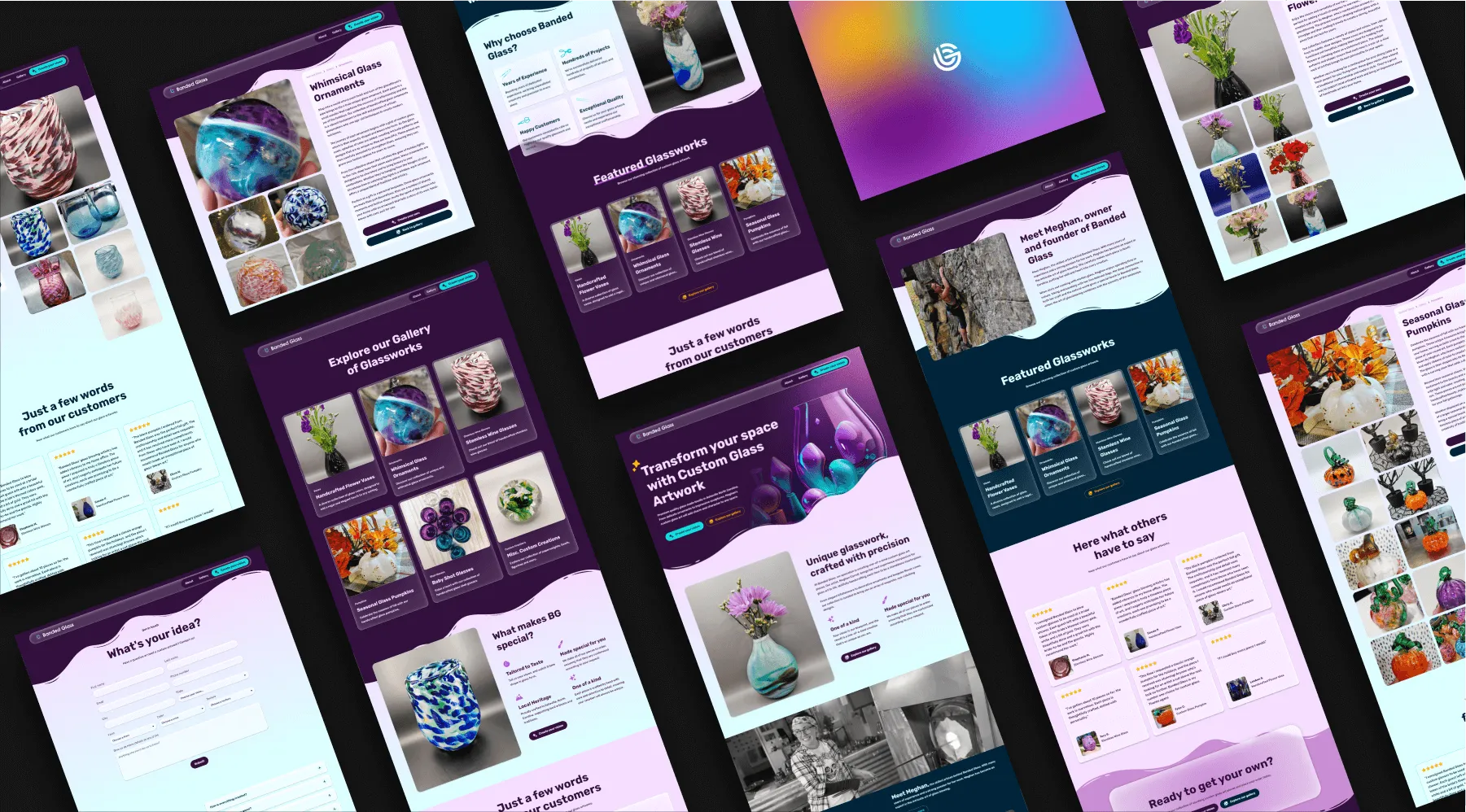
For example, if you’re building a brand/website for a construction company and want a color scheme that feels bold, modern, and vibrant to help them stand out, you can find plenty of examples from existing websites. While you shouldn’t completely copy someone else’s design, you can definitely draw inspiration from their color schemes and styles.
Feel free to look through my portfolio if you want some great color and design ideas! 😉
Some Useful Tools for Choosing Colors
Now that you’ve got the basics down, here are some handy tools to help you pick the perfect colors:
- Adobe Color
- Adobe Color is a fantastic tool for creating and exploring color schemes. You can create custom palettes and even extract colors from images.
- Coolors
- Coolors is a super user-friendly tool for generating and customizing color palettes. You can easily tweak and save your favorite schemes.
- Happy Hues
- Happy Hues is a real-time website that shows you what different color palettes would look like live on a website.
- Color Hunt
- Looking for inspiration? Color Hunt offers a collection of curated color palettes. It’s great for getting new ideas.
- Paletton
- Paletton helps you visualize different color schemes and combinations. It’s perfect for experimenting with various palettes.
- Canva Color Wheel
- Canva’s color wheel tool assists in selecting harmonious colors. It’s simple and intuitive.
- Material Design Color Tool
- Google’s Material Design Color Tool is excellent for creating modern, visually appealing color palettes.
Wrap-up
Choosing the right color scheme for your website is more than just picking your favorite colors. It’s about understanding color psychology and how it affects user behavior. By using the tips and tools we’ve discussed, you can create a color scheme that not only looks amazing but also enhances user engagement and reflects your brand’s identity.
Need help picking the perfect colors for your website? Hit me up! I’d love to chat and help you bring your vision to life.

More recent insights


Stand out from the crowd, and take center stage
Your website is your 24/7 salesperson. Let’s make sure it's saying the right things.